Developer Offer
Try ImaginePro API with 50 Free Credits
Build and ship AI-powered visuals with Midjourney, Flux, and more — free credits refresh every month.
AI Data Visualization Tools Are Not Enterprise Ready Yet
The promise of AI in data analytics sounds revolutionary: simply upload a messy CSV file, and within minutes, receive a polished, interactive chart perfect for a board presentation. This is the exact pitch from Chinese startup Manus.im with its new data visualization feature.
However, initial hands-on testing with corrupted datasets reveals a significant roadblock for enterprise use. While these new AI tools show impressive capabilities, they suffer from a critical lack of transparency in how they transform data. Although Manus demonstrates a superior ability to handle messy data compared to ChatGPT, neither platform is quite ready to produce visuals that can be confidently presented in the boardroom.

The Spreadsheet Problem in Enterprise Analytics
A major hurdle in business intelligence is the persistent reliance on spreadsheets. A Rossums survey of finance leaders revealed that 58% still primarily use Excel for monthly KPIs, even when they have BI software. Another study highlighted by TechRadar suggests that this dependency affects around 90% of all organizations. This creates a "last-mile data problem," where governed data from warehouses is hastily exported to CSVs for urgent analysis, bypassing proper protocols.
Manus aims to solve this by allowing users to upload a CSV and describe their desired chart in natural language. The AI agent then automatically cleans the data and generates a PNG chart, eliminating the need for manual pivot tables.
Manus vs ChatGPT: A Head-to-Head Test
To test their capabilities, both Manus and ChatGPT’s Advanced Data Analysis were given three datasets of varying sizes: e-commerce orders, a marketing funnel, and SaaS MRR. Each dataset was tested in both a clean state and a corrupted state with 5% injected errors like null values, mixed-format dates, and duplicates.
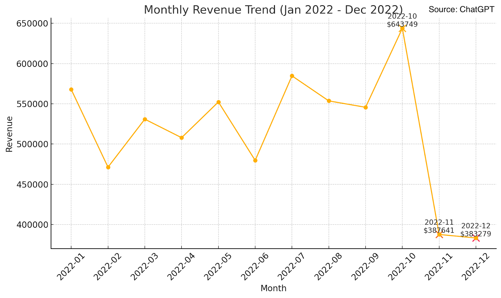
A prompt to "Show me a month-by-month revenue trend for the past year and highlight any unusual spikes or dips" on the e-commerce data yielded stark differences:
| Tool | Data Quality | Time | Cleans Nulls | Parses Dates | Handles Duplicates | Comments |
|---|---|---|---|---|---|---|
| Manus | Clean | 1:46 | N/A | ✓ | N/A | Correct trend, but incorrect numbers |
| Manus | Messy | 3:53 | ✓ | ✓ | ✗ | Correct trend despite inaccurate data |
| ChatGPT | Clean | 0:57 | N/A | ✓ | N/A | Fast, but incorrect visualization |
| ChatGPT | Messy | 0:59 | ✗ | ✗ | ✗ | Incorrect trend from unclean data |
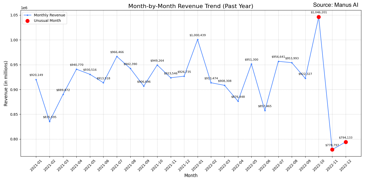
Manus acts like a cautious junior analyst. It automatically cleans the data, handling nulls and inconsistent date formats without being asked. This resulted in a coherent visualization even from corrupted data, though it took nearly four minutes.
ChatGPT operates like a speed coder. It prioritizes a fast response over data quality, producing misleading charts from messy data in under a minute because it failed to perform any cleaning.
Despite their different approaches, both tools failed to produce "executive-ready" visuals. Key elements like axis scaling, readable labels, and consistent number formatting required several follow-up prompts.
The Black Box Problem: Why Transparency is Critical
The biggest issue with Manus for enterprise adoption is its lack of transparency. The agent never reveals what cleaning steps it performed on the data. An auditor has no way of knowing if outliers were removed, values were imputed, or data was transformed. When a CFO presents a chart from Manus and is asked how duplicate transactions were handled, there is no answer. This is a critical failure of auditability.
While tools like ChatGPT, Claude, and Grok provide the Python code they used, reviewing code is not a scalable solution for business users. Enterprises need a simple, clear audit trail to build trust in AI-generated insights.
The Rise of Warehouse-Native AI
While Manus relies on CSV uploads, major cloud platforms are integrating AI directly into their data infrastructure, which solves many of these problems.
- Google’s Gemini in BigQuery allows users to generate SQL queries and visualizations on live data while respecting existing row-level security.
- Microsoft’s Copilot in Fabric creates visuals from Lakehouse datasets directly within the Power BI experience.
- GoodData’s AI Assistant operates within a customer's own environment, aligning with predefined business metrics and semantic models.
These warehouse-native solutions keep data secure, preserve a complete data lineage, and leverage existing governance—advantages that file-upload tools cannot easily match.
Key Roadblocks to Enterprise Adoption
Testing revealed several major gaps preventing tools like Manus from being enterprise-ready:
- No Live Data Connectivity: Manus only supports file uploads, lacking connectors for Snowflake, BigQuery, or S3.
- Missing Audit Trail: There is no log of the data transformations performed by the AI, which is essential for enterprise data governance.
- Limited Export Flexibility: Output is restricted to PNG files, which is insufficient for enterprises that need interactive and customizable exports.
The Verdict: Is Manus Ready for Your Business?
For small to medium-sized businesses or teams dealing with ad-hoc CSV analysis, Manus is an impressive tool. Its ability to autonomously clean messy data can reduce analysis time from hours to minutes. It also offers a significant performance advantage over manual pivot tables in Excel or Google Sheets.
However, for regulated enterprises with governed data lakes, the recommendation is to wait for mature, warehouse-native agents like Gemini or Fabric Copilot. These tools keep data within the security perimeter and provide the complete lineage tracking that is non-negotiable for serious business analysis.
The bottom line is this: Manus proves that one-prompt charting is a viable concept and handles real-world data messiness well. But for an enterprise, the key question isn't whether a chart looks good—it's whether you can bet your career on data transformations that you can't audit or verify. Until AI agents offer rigorous audit trails and direct integration with governed data systems, Excel will continue to be the star of quarterly presentations.
Compare Plans & Pricing
Find the plan that matches your workload and unlock full access to ImaginePro.
| Plan | Price | Highlights |
|---|---|---|
| Standard | $8 / month |
|
| Premium | $20 / month |
|
Need custom terms? Talk to us to tailor credits, rate limits, or deployment options.
View All Pricing Details