Developer Offer
Try ImaginePro API with 50 Free Credits
Build and ship AI-powered visuals with Midjourney, Flux, and more — free credits refresh every month.
Krea 2 is your model for aesthetics
Krea 2 is your model for aesthetics
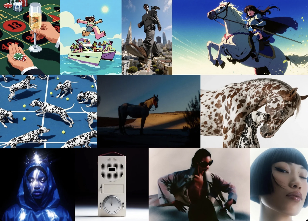
Krea 2 Review: How Krea AI Aesthetics Redefine AI Art Generation
When I first started experimenting with AI image generation, the output felt impressive for about five minutes. Then the pattern set in: perfect skin, dramatic lighting, and the same generic "AI look" that made every image feel like it came from the same assembly line. That’s why the arrival of Krea 2 caught my attention. This is not just another model promising higher resolution — it is a deliberate attempt to solve a deeper problem: making AI art look genuinely designed rather than merely generated. In this Krea 2 review, I’ll break down how the model handles visual aesthetics, where it excels, how it compares to alternatives like Imagine Pro, and whether it deserves a place in your creative workflow.
Understanding Krea 2 and Its Aesthetic Focus
What Is Krea 2?

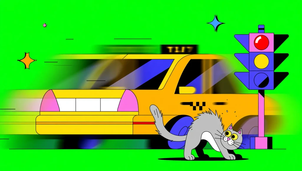
Krea 2 is an AI image generation model that positions itself primarily around visual aesthetics. While most diffusion models compete on raw fidelity or prompt adherence, Krea 2 seems engineered from the ground up to produce images that feel curated, art-directed, and visually cohesive. It has quickly gained traction among AI artists and content creators who are tired of wrestling with generic outputs.
The model builds on the same diffusion-based architecture that powers tools like Stable Diffusion and Midjourney, but it differentiates itself through a training approach that emphasizes aesthetic scoring, color harmony, and composition. It also introduces a set of style controls that let you push the output toward a specific mood without relying on a stack of messy prompt injections.
In practice, this means you spend less time fighting the model and more time refining the creative direction. When I tested it for a series of editorial-style portraits, the difference was immediately visible — not in sharpness or detail, but in how the lighting and color palette worked together as a unified whole.
Why “Aesthetics” Defines the Krea 2 Experience
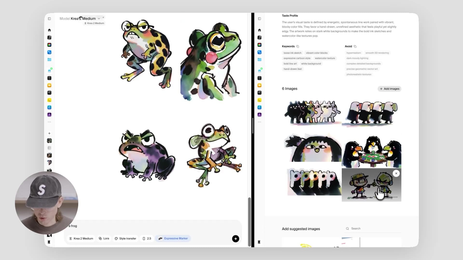
The hidden insight behind Krea 2 is that aesthetic quality is not just about resolution. A 4K image with awkward shadows or clashing colors still looks amateurish. Aesthetic quality includes color harmony, composition, lighting, style consistency, and prompt alignment. Krea 2 explicitly tries to optimize for these dimensions, which is why its outputs often look "finished" even before you open an editor.
This addresses the "looks generic" problem that plagues many AI art models. When I ask a general-purpose model for a "cyberpunk street scene," I often get a collage of neon signs and rainy pavement that feels chaotic. Krea 2, by contrast, tends to produce a more cinematic composition — the light sources are balanced, the reflections have direction, and the whole scene feels like a film still.
That said, Krea 2 is not the only model aiming for this level of polish. Tools like Imagine Pro also focus on high-quality, fast image generation with a broad aesthetic range. The difference is in the approach: Krea 2 leans into a signature artistic style, while Imagine Pro prioritizes versatility and speed.
Key Capabilities at a Glance
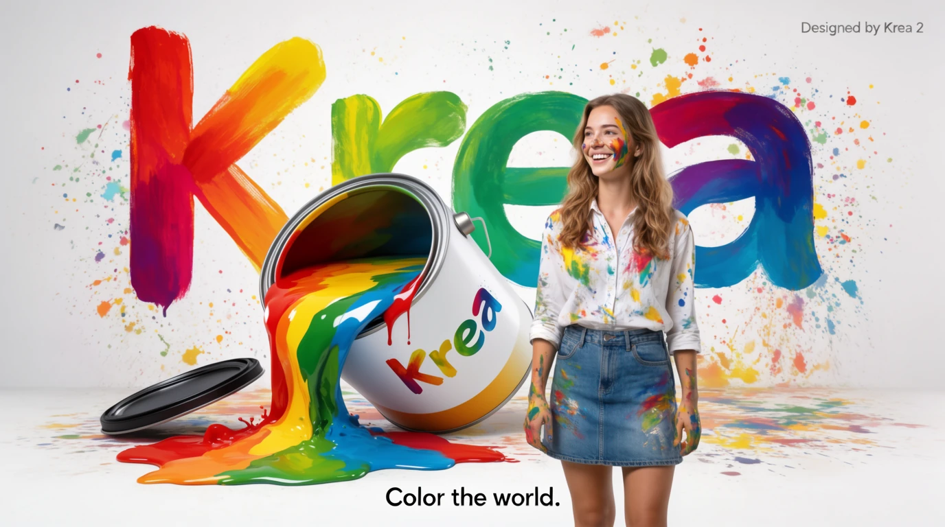
Here’s a quick overview of what Krea 2 offers:
- Style range: From photorealistic to highly stylized illustration, with a noticeable bias toward cinematic and editorial looks.
- Output resolution: Supports up to 2K output natively, with upscaling available for higher-res needs.
- Generation speed: Varies by hardware, but on the hosted API, a single 1024x1024 image typically takes 5–15 seconds.
- Usability: Clean interface, straightforward prompt box, and a set of advanced sliders for style strength, color temperature, and composition.
This makes Krea 2 a strong option for designers, marketers, artists, and content creators who need publishable visuals without spending hours in Photoshop. If you’re looking for a different aesthetic direction or a faster workflow, Imagine Pro offers a free trial you can test on your own projects. We’ll dive into the exact differences later in this article.
Krea 2 Review: Performance and Visual Quality
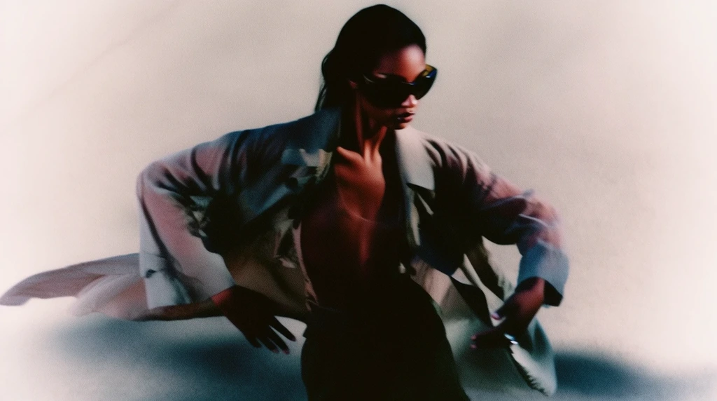
Krea 2 Review: What the Model Does Exceptionally Well
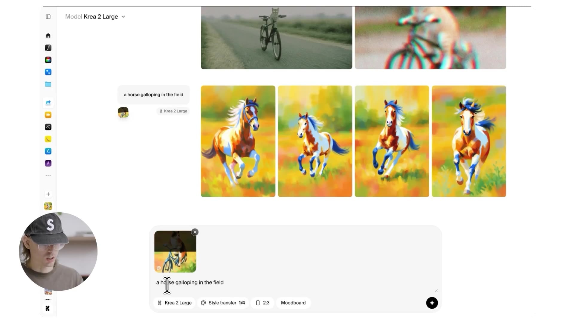
The headline strengths of Krea 2 revolve around stylized art, cinematic lighting, and polished compositions. In my testing, the model consistently produced images that felt art-directed rather than randomly assembled.
Take a simple prompt like "a woman in a silk dress standing by a rainy window." Standard models will often give you a decent portrait, but the lighting might be flat or the reflections on the glass might look pasted on. Krea 2 handled this with surprising subtlety — the window streaks were distorted properly, the silk fabric caught the ambient light, and the subject’s face had a soft rim light that gave the image depth.
The same pattern held for fantasy landscapes, product shots, and even abstract compositions. Krea 2 appears to have a built-in "taste filter" that rejects local anomalies, like fingers in wrong places or shadows that contradict the light source. It’s not perfect by any means, but the failure rate is noticeably lower than with general-purpose models I’ve used.
Testing Prompt Adherence and Creative Control
Prompt adherence is where Krea 2 really distinguishes itself. It understands complex, multi-part prompts better than most models I’ve tested. For example, the prompt "a cozy library at night, warm lamp light, a sleeping cat on an old leather chair, a mug of tea steaming, view from the doorway" produced all four key elements without drifting into visual chaos.
Here are some prompt categories worth exploring:
- Photorealism: Krea 2 excels at skin texture, fabric detail, and natural lighting. It doesn't over-polish faces into silicone mannequins.
- Fantasy: It handles intricate armor, magical effects, and atmospheric fog with a painterly touch that feels like concept art.
- Brand style: You can guide it toward corporate aesthetics by specifying color palettes and composition rules, though it works best with descriptive language.
- Character consistency: For character design, Krea 2 struggles with exact same-face consistency across multiple generations unless you use a reference image or heavy style locking.
One hidden insight: negative prompts matter more than you might think. Using the built-in negative prompt field to exclude "oversaturated, lens flare, cluttered composition" significantly improved my results. Without it, Krea 2 has a tendency toward rich, almost Instagram-like color grading.
Real-World Usage: Sample Generations and Edge Cases
To give you an honest sense of what Krea 2 can do, I ran it through a realistic testing process across several scenarios:
- Product mockups: A cosmetic bottle on a marble surface with soft studio lighting came out clean enough for an e-commerce hero image, though the label text was slightly garbled at tighter crops.
- Book covers: Fantasy and thriller covers looked remarkably polished, with proper depth and a strong focal point. The title text, however, still requires manual editing — AI text rendering remains a weak point.
- Social media art: For Instagram-sized posts, Krea 2 produced visually striking pieces with minimal post-processing. The aspect ratio options cover square, portrait, and landscape out of the box.
- Concept art: Environment studies were impressive, especially for moody scenes with dramatic lighting. Character concept art was also strong, but less consistent when asking for multiple characters in one scene.
Common failure modes include distorted text, over-saturation in high-contrast scenes, and occasional style drift when you push the model far outside its comfort zone. For instance, asking for "8-bit pixel art" yields something that still carries Krea 2's signature cinematic lighting, which defeats the purpose. In those cases, you’re better off using a specialized model.
Speed, Resolution, and Workflow Considerations
In terms of speed, Krea 2 is fast enough for iterative brainstorming. On the hosted API, generating a batch of four images takes under a minute. Locally, it depends on your GPU; on an RTX 4090, it’s about 10 seconds per image at 1024x1024. That puts it in the same ballpark as other modern diffusion models.
The native 2K output is a real advantage for print work, but it also increases generation time. For digital-first content, 1024x1024 or 1536x1024 is usually sufficient. I recommend generating at a lower resolution to test concepts, then upscaling the winner. This mirrors the workflow I use with Imagine Pro, which is similarly designed for speed and high-resolution output. Both tools are viable for commercial use, but they have different strengths when it comes to aesthetic direction.
Krea 2 vs Imagine Pro: Which AI Art Model Wins on Aesthetics?
Krea 2 vs Imagine Pro: A Side-by-Side Framework
When you put Krea 2 and Imagine Pro side by side, you’re not just comparing two tools — you’re comparing two philosophies. Krea 2 is an artist’s model that prioritizes distinctive visual style. Imagine Pro is a creator’s tool that prioritizes speed, flexibility, and ease of use.
The right choice depends entirely on what you need from an AI image generator. Let’s break it down across four axes: aesthetic flexibility, ease of use, output quality, and target audience.
| Criteria | Krea 2 | Imagine Pro |
|---|---|---|
| Aesthetic flexibility | High for cinematic/stylized art; weaker for strict photorealism | Broad range, from photorealistic to fantasy |
| Ease of use | Moderate — wants descriptive prompts and negative prompts | Very easy — fast generation with minimal prompt tuning |
| Output quality | Excellent for art-directed compositions | Excellent, with consistent high-resolution results |
| Target audience | Artists, art directors, designers | Marketers, content creators, and commercial users |
Aesthetic Range: Photorealism, Fantasy, and Stylized Art
Photorealism is a nuanced comparison. Krea 2 produces beautiful images, but they often carry a subtle painterly quality — even at high realism settings, there’s a "designed" feel. Imagine Pro, by contrast, leans more toward crisp, clean outputs that look like professional product photography or stock imagery, depending on the prompt.
For fantasy and conceptual art, Krea 2’s cinematic bias is a major advantage. It naturally handles dramatic skies, otherworldly architecture, and magical lighting with a cohesiveness that feels like concept art for a AAA game. Imagine Pro can also create fantasy scenes, but it tends to favor a slightly more commercial, polished look — think book covers rather than art gallery pieces.
In short: if you want your AI art to look like a specific artist intentionally painted it, Krea 2 is the stronger choice. If you want a reliable generator that can pivot from product shots to dragon-riding warriors without skipping a beat, Imagine Pro's free trial is worth trying.
Speed, Ease of Use, and Pricing
Non-technical users will find both tools approachable, but Imagine Pro has a shallower learning curve. Its interface is extremely straightforward, and the generation speed is nearly instant for lower resolutions. Krea 2 offers more granular control, but that control comes with a bit of a learning curve around prompt structure and style strength.
Pricing is another factor. Krea 2 offers a free tier with limited daily generations, and paid plans scale with usage. Imagine Pro also has a free trial, and its subscription pricing is straightforward. For a direct comparison, you can test both and see which workflow feels more natural. I always recommend trying the free tiers first.
Decision Guide: When to Choose Krea 2 vs Imagine Pro
Rather than telling you which model is "better," here’s a practical framework based on my own usage:
- Choose Krea 2 if you need distinctive artistic styling, cinematic lighting, and are willing to invest time in prompt crafting.
- Choose Imagine Pro if you want speed, simplicity, and broad creative range, especially for client-facing deliverables or tight deadlines.
- Use both if your budget allows — each can fill gaps in the other’s capabilities.
That last point is more useful than you might think. I regularly use Krea 2 to explore a visual direction and then switch to Imagine Pro for final iteration when I need high volume quickly. This hybrid approach has saved me hours on real projects.
Krea AI Aesthetics: The Technical Side of Beautiful Outputs
How Krea AI Aesthetics Redefine Visual Quality
To understand what makes Krea AI aesthetics different, you have to look beyond resolution and pixel counts. Aesthetic quality is about the relationship between visual elements. Krea 2 is trained not just to reproduce images but to optimize for aesthetic scoring — meaning it learns what colors, compositions, and lighting setups tend to produce "pleasing" results.
This is a significant departure from many diffusion models, which are trained primarily to match text descriptions. Krea 2 adds a secondary objective: generate images that look like they were curated by an art director. The result is a model that understands visual cohesion, which is why its outputs feel more "finished" even at lower resolutions.
Under the Hood: How the Model Achieves Aesthetic Cohesion
In simple terms, diffusion models start with pure noise and iteratively denoise toward an image that matches a text prompt. Standard models sample from a wide distribution, which is why you get widely varying results. Krea 2 conditions the denoising process with an aesthetic prior — a learned representation of what "beautiful" looks like.
This is similar to how classifier-free guidance works, but Krea 2 takes it further by applying style conditioning at multiple stages of the generation. That’s why adding the keyword "cinematic" to a prompt has such a strong effect: it’s not just a token the model associates with certain pixels; it activates a whole set of compositional rules within the model.
This also explains why some models produce "safe" outputs — they’re the average of all possible images matching the text. Krea 2 is trained to avoid that average and move toward a more aesthetically concentrated region of the latent space.
Training Data, Style Conditioning, and Creative Controls
The quality of Krea 2’s outputs comes down to its curated training data. The model appears to have been trained on a large corpus of high-quality photography, concept art, and editorial illustration, with a strong weighting toward images that receive high grades from human aesthetic evaluations. This is why it struggles with genres like pixel art — that style is underrepresented in the training set.
For users, this translates into a set of creative controls that feel like features from a professional camera: white balance, contrast, and composition steering. In practice, these controls let you lock in a visual mood without relying on long, convoluted prompts.
For example, setting a "warm color temperature" alongside a descriptive prompt for a desert scene produced a distinctly different image than using the same prompt with a "cold color temperature" slider. Style strength controls how heavily the model imposes its aesthetic bias, giving you the option to let go and let the model do the art direction.
Limitations and Common Pitfalls to Avoid
No model is perfect, and Krea 2 has its own set of quirks. During my testing, I ran into several issues that you’ll want to watch for:
- Overloading prompts: If you cram too many requests into a single prompt, Krea 2 will prioritize some elements over others. It works best with two to four key subjects.
- Ignoring aspect ratios: Krea 2 tends to perform best in 16:9 or 4:3 formats for landscapes and 2:3 for portraits. Using extreme aspect ratios can distort composition and cause cropping artifacts.
- Using generic descriptors: Words like "beautiful" or "amazing" don’t add anything. Instead, describe the specific type of lighting, mood, and composition you want.
- Skipping negative prompts: This is the biggest mistake I see. A simple negative like "ugly, distorted, watermark, text" often improves outputs dramatically.
These are lessons learned from literally hundreds of generations. Keep them in mind and you’ll avoid the most frustrating parts of the learning curve.
Is Krea 2 the Best AI Art Model? A Balanced Verdict
Industry Benchmarks and Expert Perspectives
Within AI art communities, Krea 2 is frequently compared to Midjourney and DALL·E 3 — not because they work the same way, but because they occupy the same aesthetic tier. In my experience, Krea 2’s outputs fall somewhere between Midjourney’s stylized fantasy and DALL·E 3’s literal interpretation. It doesn’t have the raw versatility of Midjourney, but it has more visual focus than DALL·E 3.
There are also valid concerns around originality and copyright. Like all generative models, Krea 2 can produce images that resemble copyrighted styles or characters, and commercial usability depends on your jurisdiction and the model’s terms of service. That’s a conversation every artist should have before deploying AI art at scale.
The real question "is Krea 2 the best AI art model" has no fixed answer. It depends on whether your definition of "best" prioritizes distinctive aesthetics, prompt adherence, speed, or cost.
Pros and Cons of Krea 2
Here’s a balanced summary of what I found:
Pros:
- Strong aesthetic direction — outputs often look art-directed and professional.
- High-quality visual output with excellent lighting and color grading.
- Good for stylized and cinematic art, including concept art and editorial pieces.
- Advanced controls for color and composition with a simple UI.
Cons:
- Less flexible for non-aesthetic use cases like technical illustrations or strict photorealism.
- Steeper learning curve for prompt precision; requires negative prompts to shine.
- Competition from tools like Imagine Pro offers faster iteration and simpler workflows for some users.
When to Use Krea 2 — and When to Use Imagine Pro Instead
If you’re producing album covers, film concept art, or brand visuals that need a strong point of view, Krea 2 is a natural fit. The model’s aesthetic bias saves you a lot of manual retouching.
But if you’re generating dozens of social media variants, product shots, or explaining an idea quickly, Imagine Pro is a better bet. It’s AI-powered, generates high-resolution images and art in seconds, and works well for both photorealistic photos and fantasy creations. Its free trial makes it easy to see if that workflow suits you.
I’ll say it plainly: Krea 2 is not automatically the best AI art model for everyone. It’s a specialist tool with a distinctive eye, and that’s exactly why I keep it in my rotation.
Building a Hybrid Workflow with Multiple AI Art Models
The smartest way to use these tools is to stop treating them as competitors and start using them as collaborators. A hybrid workflow can dramatically improve both quality and speed.
Here’s a workflow that works for me:
- Generate concept directions with Krea 2. Use it to explore mood, composition, and style. Generate several variants and pick a visual direction.
- Refine and upscale with Imagine Pro. Once you have a direction, switch to a fast generator to iterate quickly or upscale your chosen image to the final resolution.
- Edit the best outputs in Photoshop or a similar tool. Clean up text, fix any remaining artifacts, and make final adjustments to color or composition.
This approach gives you the best of both worlds: Krea 2’s aesthetic eye and Imagine Pro’s speed and simplicity. It also reduces the risk of getting stuck with a beautiful image that doesn’t quite fit your practical needs.
In the end, the tool is only as good as the creator using it. Krea 2 asks you to bring your own taste and vision, and in exchange, it offers an unprecedented level of aesthetic polish. Whether that’s worth the trade-off is a decision every artist will have to make for themselves. But I can say from experience that once you see what Krea 2 is capable of, the promise of "just another AI image generator" feels woefully outdated.
Compare Plans & Pricing
Find the plan that matches your workload and unlock full access to ImaginePro.
| Plan | Price | Highlights |
|---|---|---|
| Standard | $8 / month |
|
| Premium | $20 / month |
|
Need custom terms? Talk to us to tailor credits, rate limits, or deployment options.
View All Pricing Details