Developer Offer
Try ImaginePro API with 50 Free Credits
Build and ship AI-powered visuals with Midjourney, Flux, and more — free credits refresh every month.
Krea 2 is your model for aesthetics - Updated Guide
Krea 2 is your model for aesthetics - Updated Guide
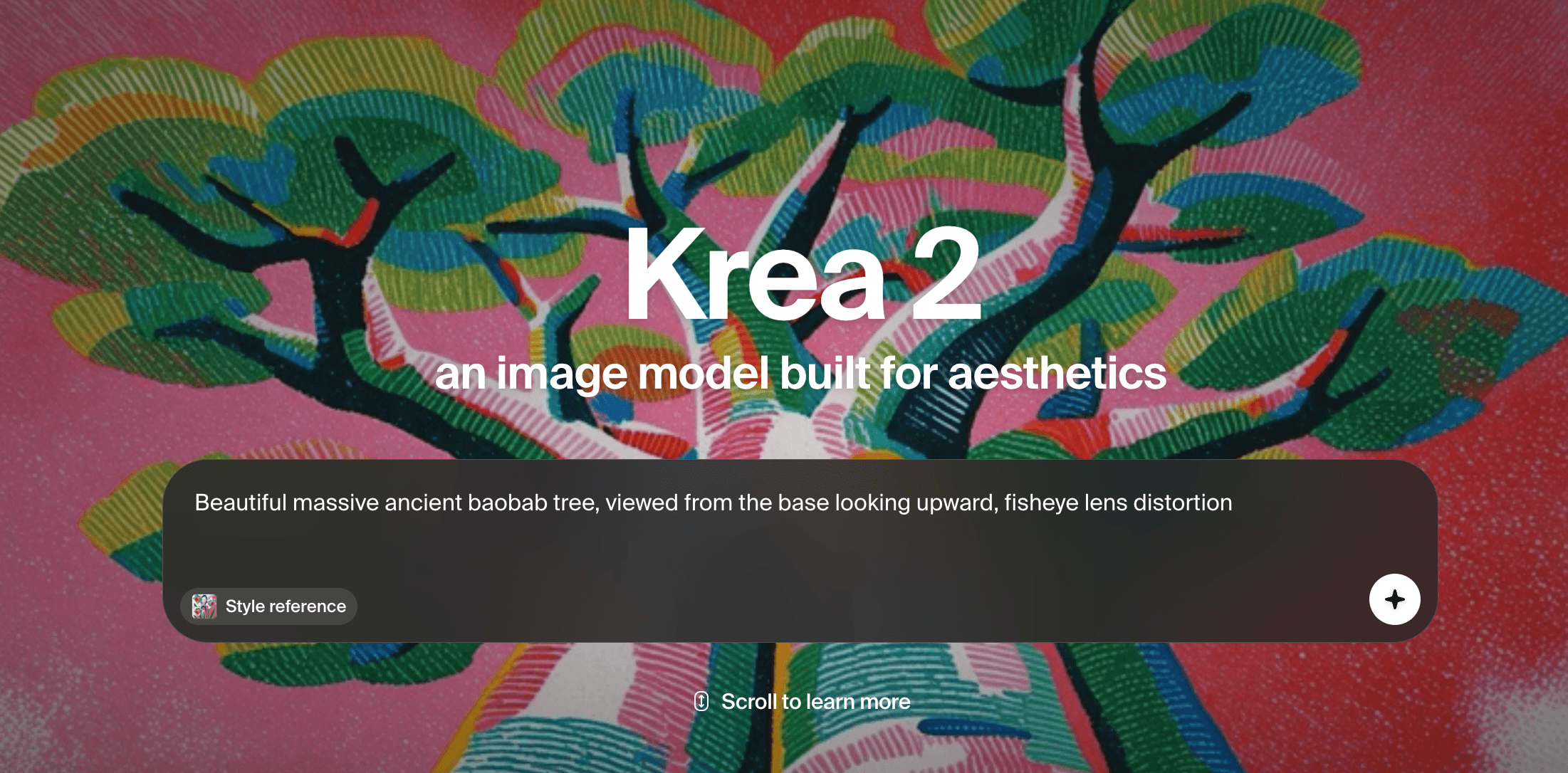
What Changed in the Latest Krea 2 Aesthetic Update: A Deep Dive for AI Aesthetics Generator Users
Every few months, an AI aesthetics generator gets a quiet refresh: a new checkpoint, a retuned preference model, a slider that behaves differently. The latest Krea 2 aesthetic update fits that pattern, and it matters more than most release notes suggest. If your portfolio, brand kit, or client deliverables were built on Krea's earlier look, the update is not just "new stuff to try" — it is a reason to re-baseline your reference prompts, your seeds, and your expectations. This deep dive walks through what actually changed, how Krea 2 compares with faster alternatives like Imagine Pro, and how to build a production workflow that survives the next update.
What Changed in the Latest Krea 2 Aesthetic Update

The headline is that Krea continues to optimize for style and aesthetic coherence rather than raw realism alone. Practically, that means the model's default output is opinionated: it makes compositional choices for you. Updates to an opinionated model are more disruptive than updates to a neutral one, because your learned prompt habits were calibrated to the old bias.
Model Version and Aesthetic Drift
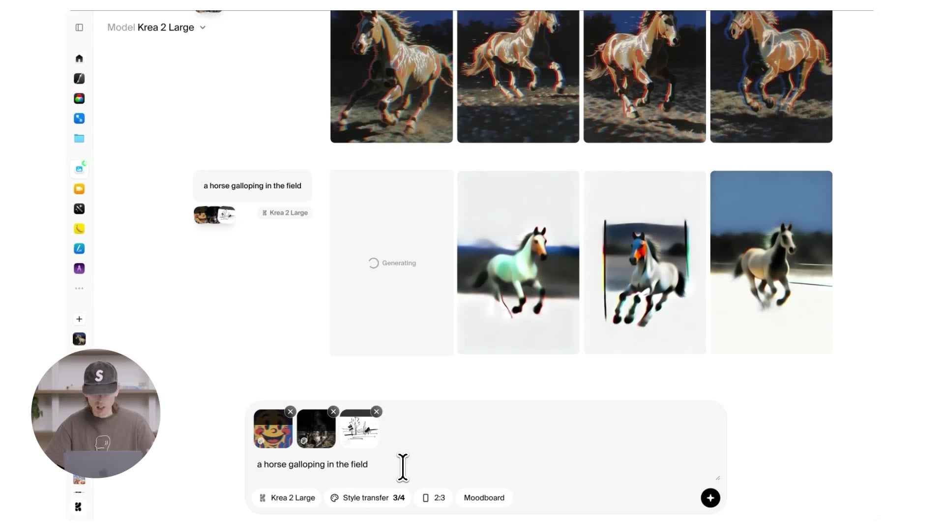
Aesthetic drift is the slow movement of a model's visual signature across versions. It happens for mundane reasons: new captioning pipelines, rebalanced training mixes, stronger preference optimization, or a different default guidance scale. A face that used to render with soft, diffuse light may now come back with higher micro-contrast. Backgrounds may become denser or cleaner. Color grading may shift a few points warmer.
For existing users, the practical response is a canary set: five to ten prompts you have generated before, saved with their seeds, settings, and output images. Re-run the set after any update and compare side by side at 100% zoom. Pay attention to skin texture, fabric weave, hair edges, hand anatomy, small typography, and how the model handles cluttered scenes. These are the areas where drift shows up first — and they are exactly the areas that break client work.
New Styling Controls or Output Improvements
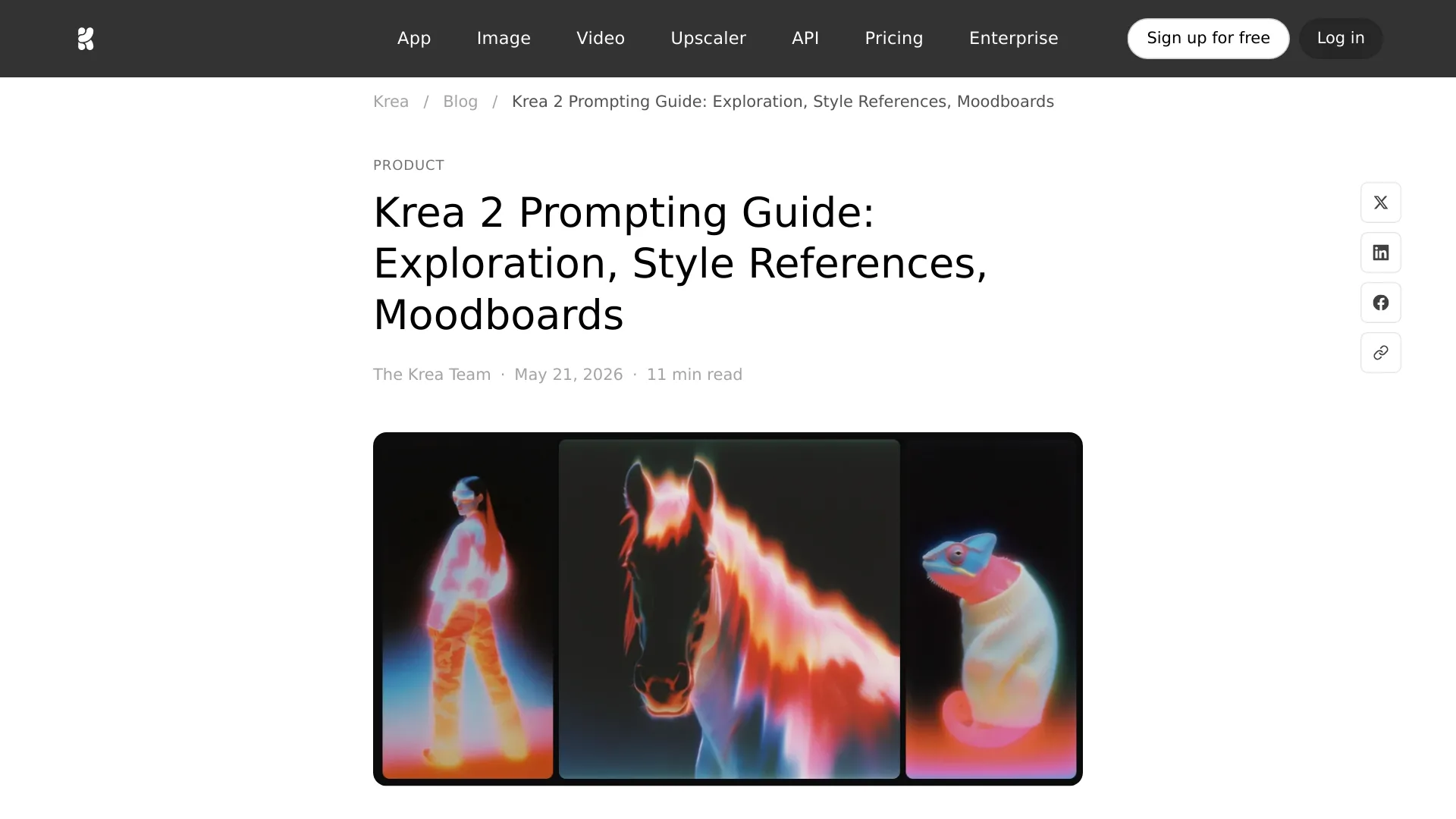
Aesthetic-focused releases tend to improve three things in tandem: prompt adherence, reference handling, and iteration speed. On the control side, the most consequential features in this model family have historically been separated reference modes — one for style transfer and one for subject or character consistency. Mixing those two intents into a single "reference image" slot is a common beginner mistake, because style references and subject references need different strength settings.
On the output side, look for improved handling of extreme aspect ratios (cinematic 21:9, vertical 9:16 for social), better native resolution before upscaling, and faster preview loops. The honest caveat: exact feature names, default values, and version numbers change frequently. Verify specifics in Krea's official documentation and changelog rather than relying on secondhand summaries — including this one.
Why the Update Matters for Existing Workflows
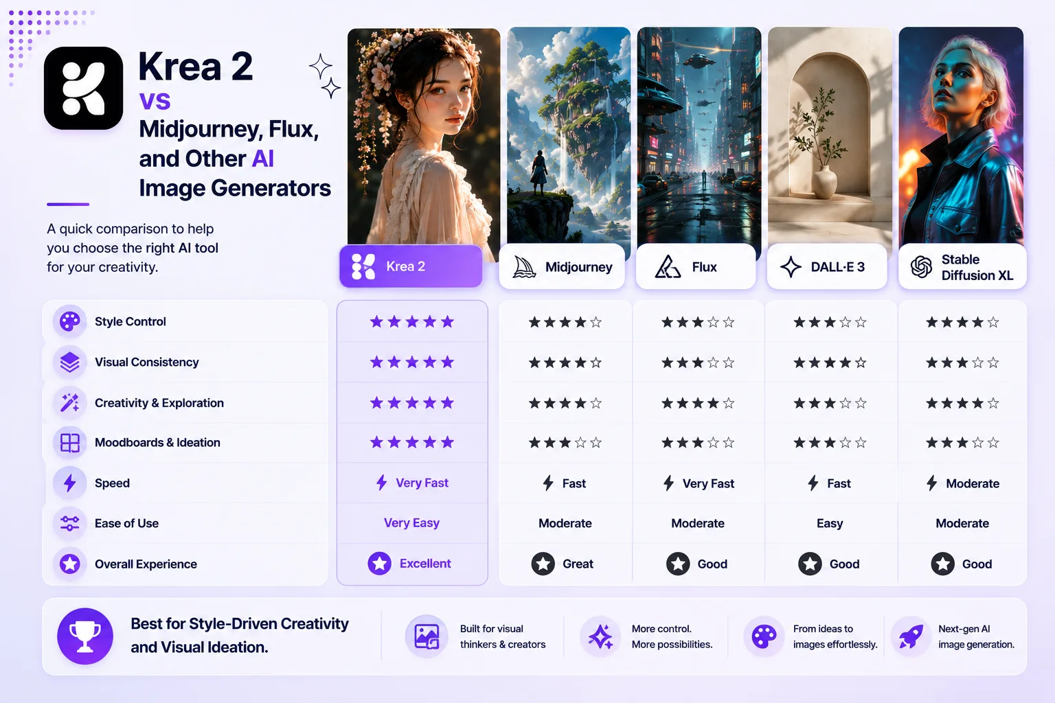
The update matters because aesthetic shifts compound. A single image regenerated with a slightly different look is a minor annoyance. Thirty images that no longer match a campaign's existing visual language is a rework bill. Illustrators who built moodboards around Krea's older color behavior now need to re-decide whether the new defaults are an upgrade or a regression. Marketers running consistent thumbnail systems need to check whether the palette still matches the brand. Teams that fine-tuned custom styles or trained adapters on the previous checkpoint have the most work to do, because adapters are tightly coupled to the base model's latent behavior.
Understanding Krea 2 AI Image Generator: Aesthetics-First Foundations
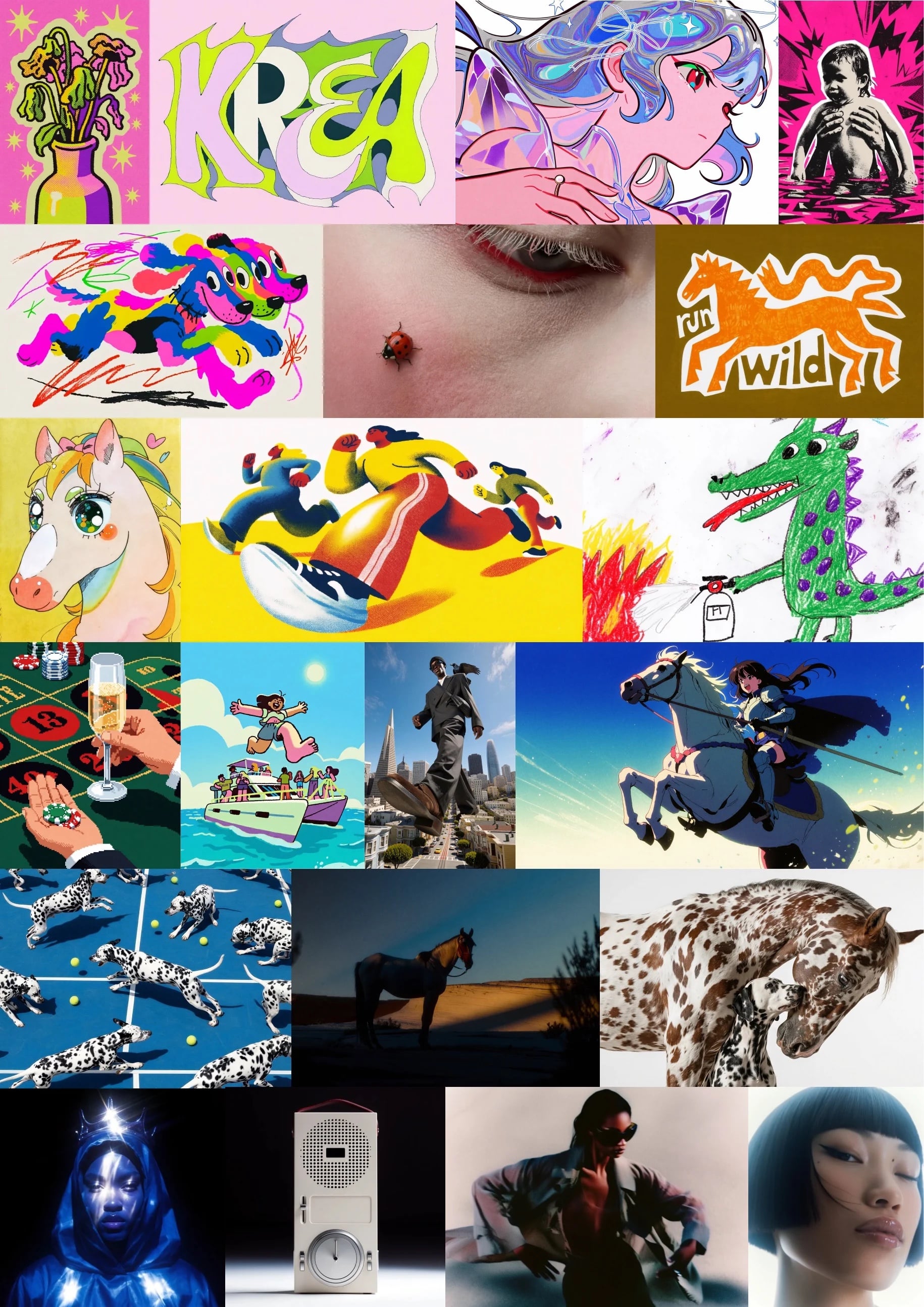
Krea's positioning has always been clear: it is less a "type anything, get anything" tool and more a visual instrument. That framing explains its strengths and its limitations, and it explains why comparisons against speed-first platforms often talk past each other.
What "Aesthetics" Means in the Krea 2 Model
Aesthetic quality in AI art is not one thing. It decomposes into composition (where the eye is led), lighting (direction, softness, contrast ratio), color harmony (palette discipline, saturation restraint), texture fidelity (pores, grain, material response), mood (the emotional read), and stylistic coherence (whether the image feels like one artist made it). A strong aesthetic model does not maximize all six independently — it balances them. Aesthetic scoring in modern pipelines typically traces back to CLIP-based preference predictors and human-preference datasets, which is why models trained on such signals often produce pleasing-but-similar defaults.
Core Features That Shape Krea 2's Visual Style
When evaluating the tool, focus on five levers: style presets (which encode taste), reference images (which encode your taste), prompt handling (how literally versus how interpretively it reads you), detail rendering at native resolution, and iteration speed. The last one is underrated. A model that renders in seconds lets you explore ten directions instead of two, and exploration quality often determines final quality more than any single generation does.
How Krea 2 Works Under the Hood
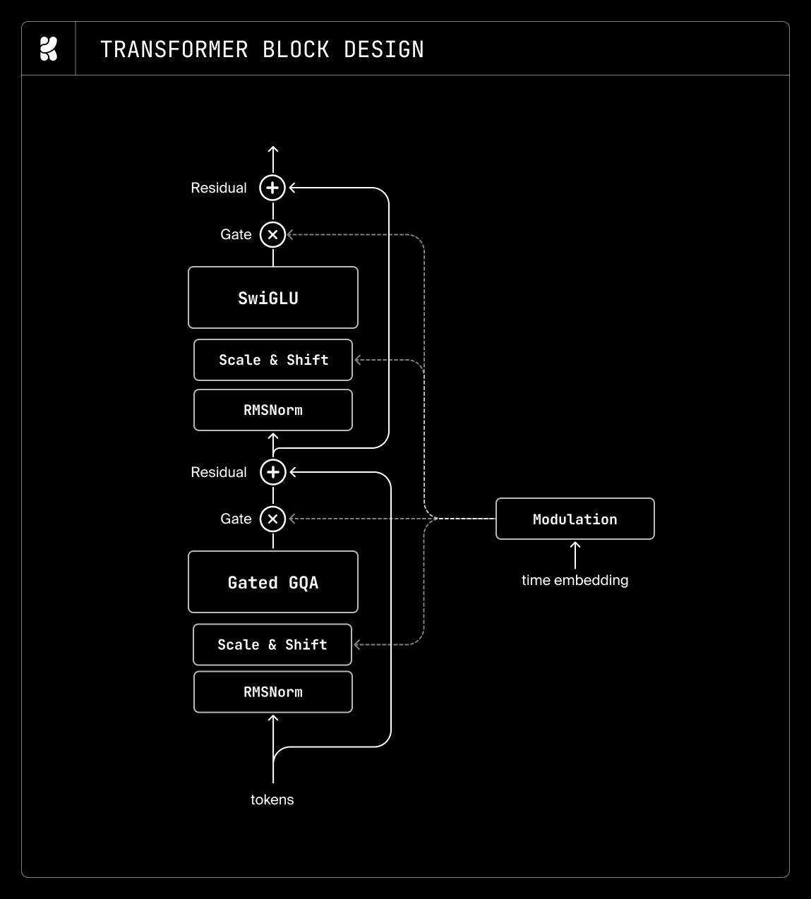
Under the hood, image generators in this class are latent diffusion systems. A variational autoencoder compresses pixels into a latent space, a denoising backbone iterates from noise toward a latent representation of your prompt, and the decoder turns that latent back into pixels. The core math was established in the denoising diffusion probabilistic models paper, and the efficiency breakthrough that made high-resolution generation practical came from latent diffusion. Prompt and image understanding leans on contrastive text-image encoders such as CLIP, while modern aesthetic tuning — including multi-aspect-ratio conditioning, micro-conditioning on resolution and cropping, and dedicated refinement stages — was popularized by architectures like SDXL.
Two tuning details drive the "aesthetic" feel you experience. First, data curation: aesthetic scoring filters and weights training images, so the model sees disproportionately well-composed art. Second, preference fine-tuning, where outputs are ranked and the model is nudged toward the preferred distribution. Both push the model away from the statistical average and toward a house style.
Krea 2 vs Imagine Pro: Which AI Aesthetics Generator Fits Your Workflow?
The useful comparison is not "which is better," but which failure mode you can tolerate. Krea 2 rewards experimentation and punishes impatience. Speed-first platforms reward throughput and punish requests for fine-grained control.
Output Quality and Aesthetic Range
| Dimension | Krea 2 | Imagine Pro |
|---|---|---|
| Signature strength | Distinctive, style-forward | Clean, broadly appealing |
| Photorealism | Good, but stylized by default | Strong emphasis on photorealistic results |
| Fantasy / concept art | Excellent for mood and atmosphere | Designed for fantasy output in seconds |
| Color grading | Opinionated, cinematic | Predictable, easy to match to brand |
| Control granularity | High — references, strength, seeds | Streamlined; fewer knobs, fewer mistakes |
| Detail retention on upscale | Depends on pipeline | Prioritized as a core feature |
The pattern that emerges: Krea 2 is where you go to discover a look; Imagine Pro is where you go to produce one at scale.
Speed, Resolution, and Ease of Use
Krea's iteration loop is built for exploration — generate, nudge, generate again. High-resolution output usually involves an explicit upscale pass, which adds a step and a decision. Imagine Pro compresses that: it advertises high-resolution images and art generated in seconds, so the default path from prompt to usable asset is shorter. For a beginner, fewer settings means fewer ways to produce something muddy; for an experienced artist, fewer settings can also mean hitting a ceiling.
Pricing, Free Trials, and Commercial Rights
Both tools operate on tiered access. Krea's free tier is useful for evaluation but constrained on generation volume and sometimes resolution; paid tiers unlock more throughput and features. Imagine Pro offers a free trial that lets you test the real workflow before committing. Licensing deserves more attention than it usually gets: check whether commercial use is permitted on your specific plan, whether outputs are owned by you or licensed, and whether the terms allow client work at your agency's scale. These policies change, so verify at the point of purchase.
Where Imagine Pro Excels for Photorealistic and Fantasy Art
If your bottleneck is turnaround — social assets due today, product mockups due in an hour, a fantasy illustration needed for a pitch deck — the trade-off flips. Imagine Pro is built around AI-powered generation of high-resolution images and art in seconds, spanning photorealistic photography and fantasy creation, with a free trial to test it against your own prompts. For teams that need volume with minimal setup, that combination is often the deciding factor.
Krea 2 Review: Strengths, Weaknesses, and Real-World Results
What Testers Praise About Krea 2
The consistent praise centers on taste. Users report that default outputs need less "fixing" in post, that lighting feels deliberate rather than random, and that style exploration is genuinely fast. The reference-image workflow and community-preset ecosystem make it easy to borrow a visual language and then bend it, which is precisely what concept artists and art directors want from an aesthetics tool.
Limitations and Common Frustrations
The complaints are equally consistent. Speed on high-resolution passes can feel slow relative to streamlined alternatives. Consistency across a batch of twenty images is imperfect — character features drift, and props quietly change between frames. The learning curve is real: understanding reference modes, strength values, and when to stop iterating takes practice. Finally, the model's taste is a double-edged sword. When every output shares the same tasteful sheen, portfolios start looking interchangeable.
Who Should Use Krea 2—and Who Should Consider Imagine Pro Instead
Choose Krea 2 if you are doing moodboards, concept art, stylized exploration, or work where the visual signature is the product, and you have the time to tune prompts. Choose Imagine Pro if you need photorealistic or fantasy outputs quickly, with high resolution out of the box and minimal configuration. Freelancers usually benefit from both: one for client-approved exploration, one for the final deliverable that has to land on time.
How to Evaluate the Best AI Art Model for Aesthetics
Rather than trusting a leaderboard, build your own rubric. It takes an afternoon and it will outlast every model release.
Aesthetic Scoring: Composition, Lighting, Color, and Detail
Score each dimension 1–5 across at least twenty generations. Composition: is there a clear focal point and a readable hierarchy? Lighting: is there a consistent light direction and plausible shadow behavior? Color: is the palette disciplined, or does it wander? Detail: do textures hold up at 100% zoom, or dissolve into mush? Aggregate scores hide weaknesses, so keep them separate.
Prompt Adherence vs. Artistic Interpretation
Decide, per project, which matters more. For product shots, brand assets, and technical illustration, adherence is non-negotiable — a "blue ceramic mug" must be blue, ceramic, and a mug. For editorial and concept work, interpretation often produces better art than obedience. Test both: write one hyper-specific prompt and one deliberately open prompt, and see which direction the model handles more gracefully.
Consistency Across Styles and Subjects
Consistency is the hardest and most expensive requirement. Test it deliberately: generate the same character across five lighting setups, the same product across three backgrounds, and the same style across four subjects. Track face drift, logo distortion, and whether shadows remain consistent. Then repeat the whole batch a week later with identical seeds to measure repeatability.
Benchmark Checklist for AI Aesthetics Generators
Before committing budget, verify: output quality at your target aspect ratio, native versus upscaled resolution, average generation time at your quality tier, control depth (references, seeds, inpainting), cost per usable image — not per generated image — licensing terms for commercial use, and export formats. Include Imagine Pro in the speed, resolution, and photorealistic/fantasy columns; its strength is exactly those rows.
Practical Workflow: Using Krea 2 and Imagine Pro for Stunning Images
Step-by-Step: From Prompt to Polished Aesthetic
A repeatable pipeline: (1) define the intended mood in three adjectives; (2) write a structured prompt with subject, style, lighting, and composition; (3) generate a low-cost batch of six to twelve variations; (4) select two directions based on composition, not detail; (5) refine with reference images or a style preset; (6) upscale only the winner and do local edits in an editor.
When to Use Krea 2 for Style Exploration
Use Krea 2 when the goal is finding the look — moodboards, aesthetic experiments, stylized drafts, and early concept art. Its taste acts as a collaborator, which shortens the search when you do not yet know what you want.
When to Use Imagine Pro for High-Resolution Outputs
Switch when the look is locked and the deadline is real. Marketing creatives, social assets, and client-facing photorealistic or fantasy imagery benefit from generating at high resolution immediately rather than upscaling a low-resolution draft.
Combining Tools in a Production Pipeline
The hybrid workflow is the most practical: explore and art-direct in Krea 2, extract the locked prompt and reference language, then reproduce the direction on a speed-first platform for final resolution. Imagine Pro's free trial is a low-risk way to test whether your established style survives the translation before you commit a campaign to it.
Prompt Engineering for Better AI Aesthetics
Keywords, Style References, and Negative Prompts
Structure beats keyword soup. Front-load the subject, then medium, then style, then lighting, then camera. Negative prompts work best as targeted fixes — "extra fingers, watermark, plastic skin" — not as a dumping ground for adjectives.
Subject: ceramic espresso cup, matte glaze, one chipped rim
Medium: studio product photograph, 85mm, f/2.8
Style: minimalist Japanese ceramics catalog
Lighting: single softbox from camera left, soft falloff
Composition: three-quarter angle, negative space upper right
Negative: gloss reflections, text, watermark, clutter, oversaturation
Lighting, Composition, and Mood Controls
Lighting vocabulary produces the biggest aesthetic return per word: "rim lighting," "soft shadows," "overcast diffusion," "hard noon sun," "practical light sources." Composition terms — "low angle," "rule of thirds," "centered symmetrical," "wide establishing shot" — change the image structurally. Mood terms like "cinematic," "melancholic," or "clinical" shift color and contrast more than they shift content.
Iterative Refinement and Seed Management
Treat seeds as version control. When a generation is 80% right, lock the seed and change one variable: one lighting term, one reference, one strength value. Inpainting handles the last 20%. Without seed discipline, you are re-rolling the entire image to fix a hand, which is how projects burn budget.
Avoiding Generic AI Art Clichés
Overused defaults: teal-and-orange grading, glossy plastic skin, dramatic cosmic backdrops behind ordinary subjects, and the same soft-focus, painterly finish on everything. Break them deliberately — specify film stock, specify mundane realism, or restrict your palette to two colors. Imagine Pro is useful here as a fast prompt-variation tester across both photorealistic and fantasy registers.
Advanced Techniques and Technical Deep Dive
Upscaling and Detail Preservation
Upscaling is where aesthetic work is often lost. Generic 2x upscalers smooth texture, plasticize faces, and create halos at high-contrast edges. Prefer pipelines that upscale in tiles with overlap and preserve grain, or generate natively at target resolution when the tool allows it. For print, verify pixel dimensions against your target DPI before you export — a beautiful 1024px image cannot become a 300 DPI A3 poster.
Inpainting, Outpainting, and Local Edits
Inpainting fixes hands, eyes, and small objects without touching the rest of the composition. Outpainting extends a canvas, which is how you turn a square concept into a 21:9 banner without regenerating the subject. The key discipline is mask quality: feather the mask slightly, and describe the whole scene in the prompt — not just the masked region — or the local edit will not match surrounding lighting.
Style Transfer, LoRA, and Custom Aesthetic Profiles
If you need a repeatable house style, adapters are the mechanism. Low-rank adaptation (LoRA) lets you train a lightweight style or character layer on top of a frozen base model, and the caveat is always the same: adapters bind to a base checkpoint. When Krea ships an update, expect to retrain or re-tune. Simpler alternatives, like locked reference libraries and fixed prompt templates, are less powerful but survive version changes intact.
Model Settings That Affect Aesthetic Quality
| Setting | Typical effect | Practical guidance |
|---|---|---|
| Steps | Detail and rendering time | 25–40; beyond that returns diminish |
| Sampler | Texture and edge character | Test 2–3, then standardize |
| Guidance scale | Prompt adherence vs. naturalism | 4–7 is the usable band |
| Resolution | Composition and detail ceiling | Generate at or near target |
| Batch size | Exploration breadth | Prefer many seeds, not many steps |
When advance control is not the priority, simpler platforms handle these decisions for you — which is the trade you make for speed.
Real-World Use Cases for Krea 2 and Imagine Pro
Concept art and game design. Krea 2 excels at character, environment, and prop ideation where mood drives the decision. Consistency across a sheet of props, however, still requires reference discipline or a trained adapter.
Marketing, branding, and social media. Campaign visuals, ad creatives, and thumbnails need repeatability more than novelty. Lock a palette and lighting recipe, then produce at volume — the point where speed-first generation becomes decisive.
Photorealistic product mockups. Accuracy matters more than atmosphere here. High-resolution, photorealistic output with minimal setup is the requirement, and stylized defaults are a liability.
Fantasy and sci-fi illustration. This is where both approaches shine. Krea 2 explores the world; Imagine Pro produces photorealistic photos and fantasy creations in seconds when the client needs options today.
Common Pitfalls and Lessons from Production
Overfitting to a single aesthetic. Posting a hundred images in one model's house style makes a portfolio feel machine-made. Rotate tools, references, and palettes deliberately.
Inconsistent characters and brand assets. Character drift across batches is normal. Fix it with locked seeds, reference images at consistent strength, and adapters for recurring subjects.
Copyright, licensing, and attribution risks. Commercial rights differ per plan and per tool. Model training data remains a genuinely contested area, so treat legal review as part of your pipeline for high-value work.
Performance and cost surprises. Budget in usable images, not generated ones. Failed generations, queued renders, and re-rolls are the real cost. A free trial is the cheapest way to measure that ratio before subscribing — test cost and workflow fit first.
Trust and Transparency: Privacy, Licensing, and Commercial Use
Data usage and model training policies. Read the policy before uploading client assets or unreleased product photos. Some platforms retain and may use uploads; others offer opt-out or enterprise-only guarantees. This single paragraph in a terms page can disqualify a tool for agency work.
Commercial rights for Krea 2 vs Imagine Pro. Confirm ownership, permitted uses, and restrictions on your specific tier, not the marketing page. Both offer accessible commercial potential on paid plans, but terms evolve — re-verify before each major project.
Security and team collaboration. For teams, ask about SSO, role permissions, shared asset libraries, and whether generated assets can be exported with metadata intact. Shared workspaces without access controls quietly become the weakest link in a client pipeline.
Industry Best Practices and Expert Perspectives
What professional artists look for. Control, consistency, speed, resolution, licensing clarity, and workflow fit — roughly in that order. Aesthetics matter enormously, but a model that cannot reproduce last month's look is a tool you cannot bill against.
Official documentation and community benchmarks. Trust primary sources: official docs, changelogs, and release notes, supplemented by independent comparisons from practitioners who publish prompts and seeds. Treat any benchmark without reproducible prompts as entertainment.
How to stay current. Maintain your canary prompt set, re-run it after every update, and keep a one-page record of what changed and what it cost you. That log becomes your institutional memory — and it is worth more than any single model release.
Conclusion
The latest Krea 2 aesthetic update is less a feature announcement than a reminder: in an AI aesthetics generator, taste is a moving target. Aesthetic drift changes your baselines, reference styles bind to specific checkpoints, and adapters expire with each new version. Treat evaluation as an ongoing practice — canary prompts, separate scoring for composition, lighting, color, and detail, and honest measurement of cost per usable image. Krea 2 remains one of the best tools available for discovering a look, while Imagine Pro covers the other half of the job: high-resolution photorealistic and fantasy output in seconds, with a free trial that makes the comparison cheap. Build a pipeline around both, and the next update becomes an opportunity instead of a rework ticket.
Compare Plans & Pricing
Find the plan that matches your workload and unlock full access to ImaginePro.
| Plan | Price | Highlights |
|---|---|---|
| Standard | $8 / month |
|
| Premium | $20 / month |
|
Need custom terms? Talk to us to tailor credits, rate limits, or deployment options.
View All Pricing Details